Collections >
MAFC4 - Modern Art From Contributors 4
[ Previous / Next ]
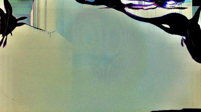
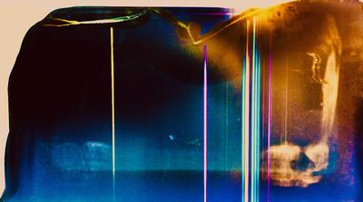
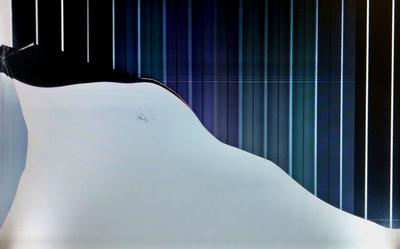
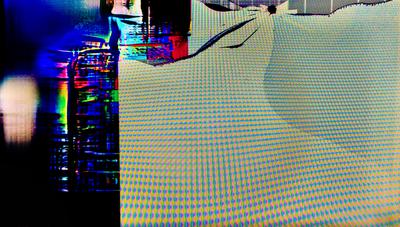
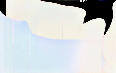
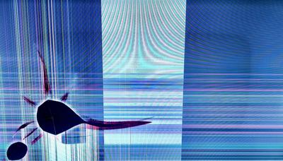
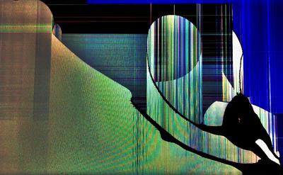
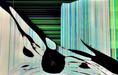
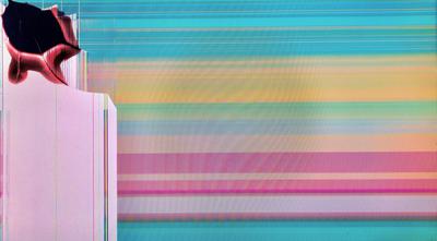
Over the years, I as the curator have solicited cracked screens from others, for eventual use when I otherwise start to run low on supply of art I can produce myself. This is the fourth such collection (1 2 3). All the screens in this collection were submitted by Jacob G. before they were edited into the works you see here. Starting off, Order Over the Smears takes the Smears archetype from the previous three MAFC collections in a new direction. The same style still characterizes the background, but now there's a sharp and dense rippling texture covering the foreground, which supports a figure towards the top of the image in its efforts to assert control. Next, Clash of Glare and Shade is a small work, and a vague one, but one whose symbolism is evident from its distribution of color. With a golden glow at one edge and a deep blue fading into black at the other, the conflict here is plain to see, and is accentuated by neon vertical lines that accentuate it. See, Over There is a sharp, digitally-textured work with an overall very straightforward appearance, but it's more concrete than most works that share its design archetype. A figure on the left reaches out with an appendage to point towards the right. Some moire culminating in the center and pushing out towards the edges combines with the horizontal lines to emphasize that direction, and give this work more of a sense of movement than might be expected. Muted Rainbow Over a Hill echoes the work Rainbow Outside a Cave from this gallery's very first collection, but as befits the improvement in the time since then, its design is much more measured and precise. This work is cleanly split into two sections, foreground and background, with no distracting elements. But my personal favorite work this week is Virtuous View, an extremely calming work with a pastel yet vibrant set of colors, distributed in horizontal bars across most of the image. The differing thicknesses and textures help keep the work from feeling boring, as do the contours and vertical lines on the right edge of the image, which provide some abstract context for the background. Please enjoy!

