Hello, and welcome to Monitors of Modern Art!
You can learn more about MOMA here,
browse our various collections, experience an
endless slideshow of our works, or look below for some
highlights of the gallery's best works.
(Warning: This site is not for mobile users browsing on data. Our images are large,
mostly uncompressed, and very data-intensive, so it is advised to view this website on a fast wi-fi
connection.)
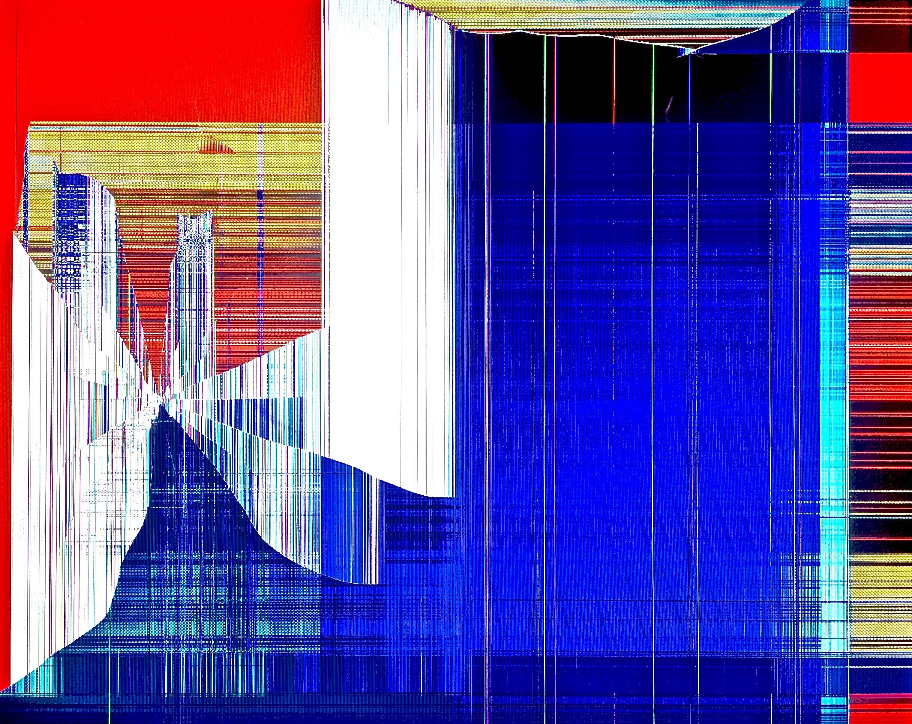
This is a good example of a work with a cohesive texture that allows it to utilize complimentary colors in close proximity to each other. Incorporating the whole trinity of red, blue, and yellow, and using a combination of vertical and horizontal lines (and the absence thereof) to define the depth of various parts of the image, make this an excellent composition.
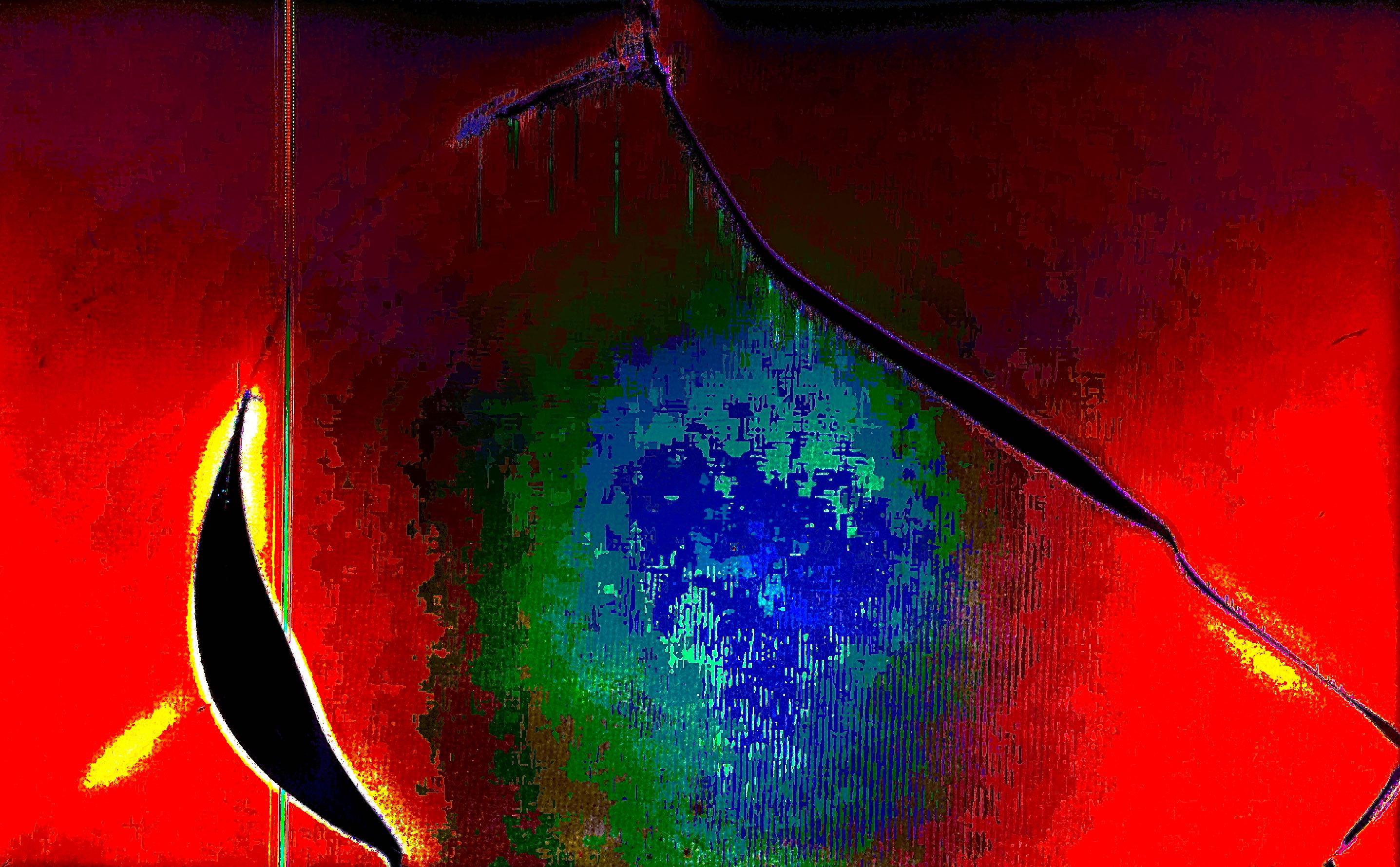
This is a fantastic work with a vey unique composition and a fascinating use of negative space and color to portray what looks like a window into a new, fantastic universe. It was taken at the same scale as most of the pixel art in this gallery, and yet does not look like pixel art at all - the work's brightness and outward motion, and blotchy shading, make it completely individual.
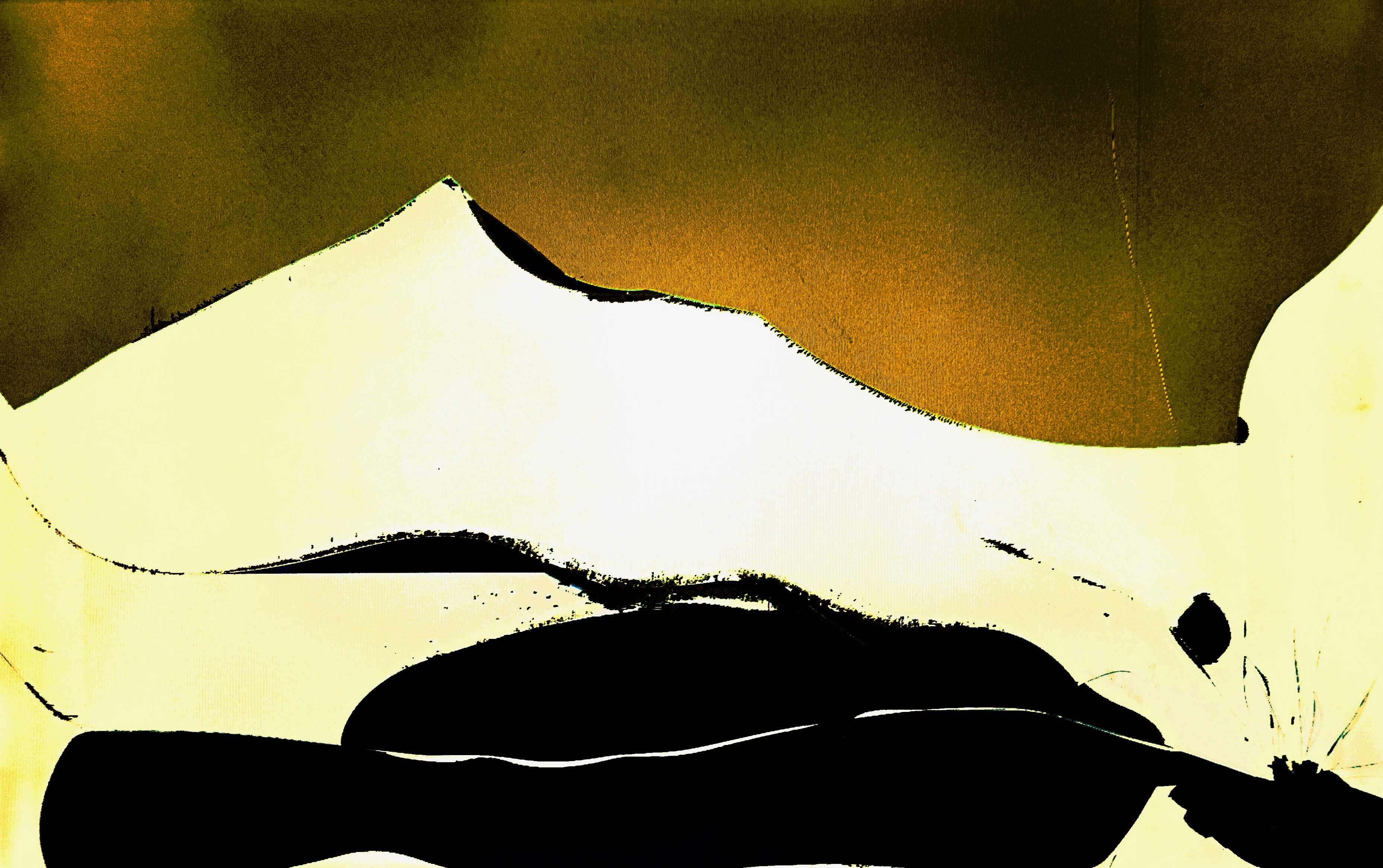
This work is especially impressive for its flaky, almost pastel-gradient style of shading, and an oddly digital texture that manifests itself more and more closer to the center of the image. These features underscore an incredible transition from a dark red to a deep blue, step by step, in an elegant way.
This work is overtly positive, mainly through its choice of palette. And yet, it remains somber, also partly through its choice of palette, as well as in structure as the negative space in the foreground seems to gaze into the distance. It also serves as a good example of a work that shines in its simplicity.
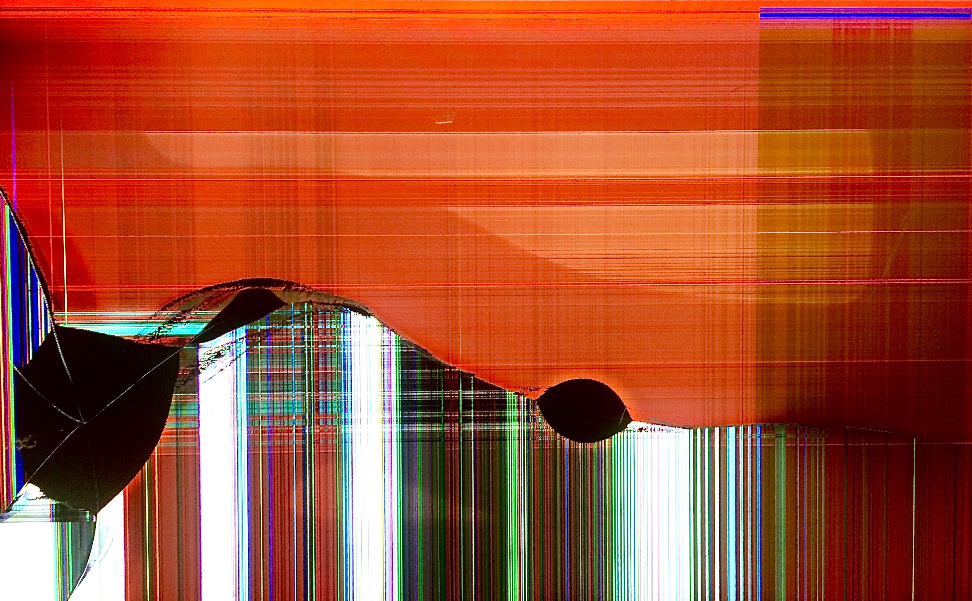
A calming work, representative of an entire class of the works in this gallery. The sunset motif is heavily visible in the background's orange-red color scheme, with the setting sun reflected in the lighter areas of the background. The feeling rolls across the smooth yet turbulent foreground from light into shadow, representing the shift from day into night.