Collections >
TLMA2 - Towards Light Modern Art 2
[ Previous / Next ]
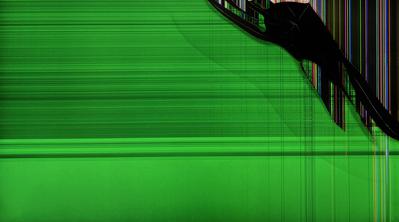
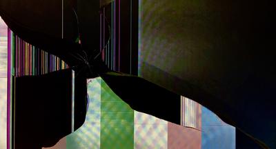
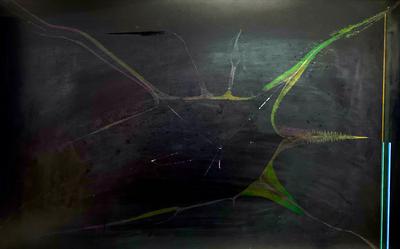
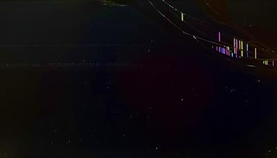
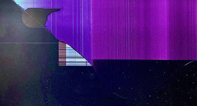
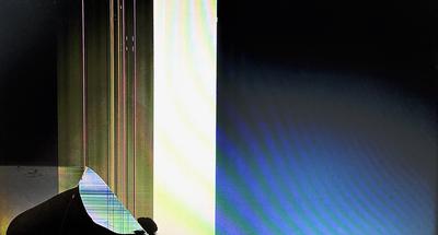
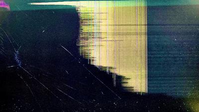
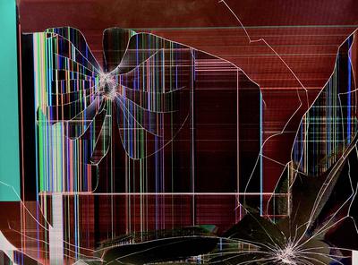
Similar to its predecessor, this collection emphasizes light, more as a subject rather than as a compositional element. Starting right off, A Shade or A Veil is sharp and concrete, the subject being the area of deep black towards the upper-left corner. Behind it is an area of darkness, interspersed with colorful vertical lines; ahead of it is the rest of the image, a relaxed green, textured with lines of a similar color. The question the work presents is which is being protected from which. Our Illumination and Their Illumination form a pair, with similar compositional styles yet contrasting results. Our Illumination is sharp, and the pillar of light raises up above an area of color, keeping the darkness at bay. Meanwhile, in Their Illumination, the pillar of light seems obscured by blackness, as though it's behind a cliff, and the viewer is cut off from it. Unleashing is a busy work of a particular archetype, and it is able to convey plenty of feeling with its colors and motion with its lines. The line of action spirals around the subject towards the upper-left, emanating from the subject in the lower-right - or does it go the other way around? But possibly the most interesting work this week is Asserted Contrast, a subdued and calm yet apprehsensive work that measuredly displays many colors in a tight, controlled way, separating them from the totally different textured lines on the left and the soft yellow-to-black gradient towards the top. The various sections of this work manage to work in harmony to make each other stand out all the more. Please enjoy!

