Collections >
MAW2 - Modern Art Workings 2
[ Previous / Next ]
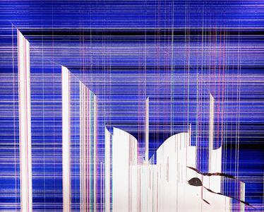
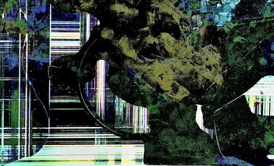
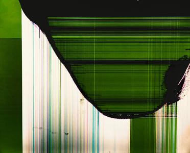
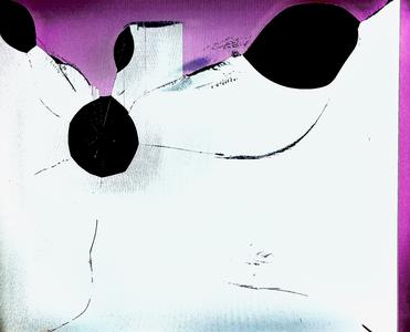
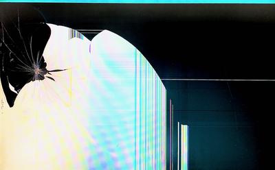
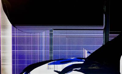
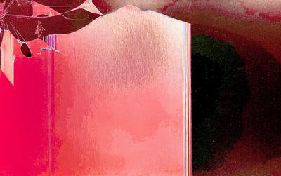
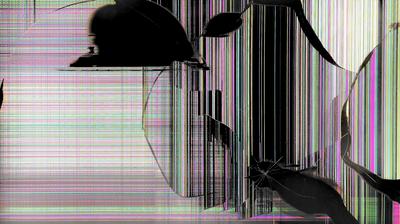
This collection, like its predecessor, takes the idea of constructions and workings and tries to interpret it more generically. Starting off, Manyrails is a very busy work, but one with both movement and purpose. The way the vertical lines proceed all the way from the bottom of the screen but tend to fade out near the top implies upwards movement, along with the horizontal lines of the background keeping a constant sense of motion, and those swirling and twisting cracks in the foreground make it seem as though a structure is under construction, or a roller coaster. Weaving Disstructure gives off a similar vibe, disorganized and frantic yet somehow still under control and building towards something cohesive and great. The wide variety of colors makes this work feel more overwhelming, and the way it both expands and then contracts from the bottom towards the top, in sync with its colors fading out towards black across a horizontal gradient of sorts, helps the work maintain a unique visual identity. Thick Book is a composed and slow-feeling work, and is one of those that takes on a different type of look depending on the perspective from which it is approached. From at least one angle, it appears as a book, which is how it got its title, but that interpretation ignores the exquisitely-shaded background. Shield Health effectively conveys the idea in its title through several different factors. First, the contour from left to right, the downward curve decreasing the colored area towards the middle and cutting it off entirely by the right side of the screen. Second, the color gradient from a pale yellow to a somehow weaker- and more desparate-feeling cyan, going hand in hand with, third, the vertical lines towards the center that add tension and anxiety as the area in which they rest gets smaller and smaller. But it's the ripple waves across the whole colored part of the image that really tie it all together as one cohesive whole, and distance it from the darkness outside against which it desparately holds. But my personal favorite work this week is Moss Over Etchings, one of those works with a unique, more organic type of technique. The 'moss' looks airbrushed on, and contrasts with - and seems to be overtaking - the more typical, and washed out, rusted, traditional framework. The black backgrounds are shaded in such a way so as to seem like foregrounds against the even further-back lightened areas to be overtaken, leading this work to an unconventional and unique overall presentation.

