Collections >
CHMA - Contrasting Hues Modern Art
[ Previous / Next ]
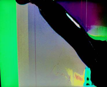
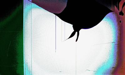
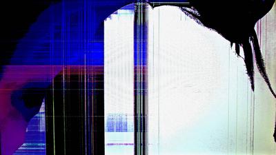
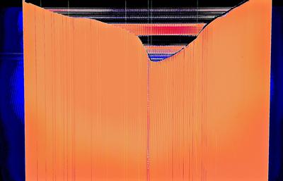
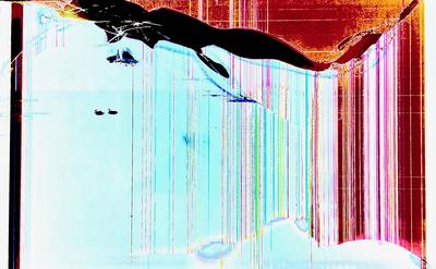
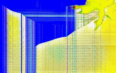
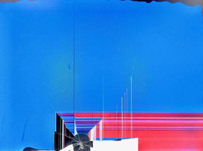
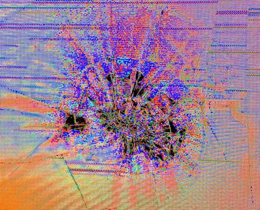
Like last week's works, those in this collection tend to have a rougher texture than usual. However, the colors on display in CHMA are, as its name would suggest, anything but calm. From Cold To Hot is the most obvious example; a light, fragile blue supported by beams of white and a simply large mass, against the fiery essence. Lemony Goo is more direct with its contrast, its bright yellow foreground clashing with its deep blue background in one corner, only for the two colors to get along better in the other corner. Small green lines, halfway between blue and yellow, help to mediate the two colors' relationship. Guarée is wholly abstract, from its title to its image; the contrast between a red/pink/yellow mixture against a solid but predictable green is at once direct yet nuanced; and the coolness of the white lined area making up the left side of the image helps again to mediate the image. Torn Through is pixel art; awash with orange against blue, with fluorescent violet highlights in the truest sense of the word. Just what this image depicts is perhaps vague and abstract, but whatever it is, its title represents it well. And finally of note, my personal favorite work this week is Bunny Bat, which, while not as colorful as many of the other works, has a more nuanced color composition in general and uses a silhouette to great effect in order to produce an unusually recognizable image. The coarse dithering between wildly different shades, combined with the general dark coloration of the work against lighter blue and cyan, helps give this work a unique atmosphere. Please enjoy!