Collections >
CCMA2 - Calm Colors Modern Art 2
[ Previous / Next ]
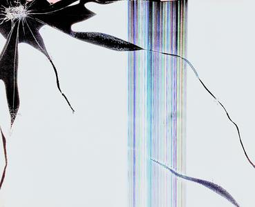
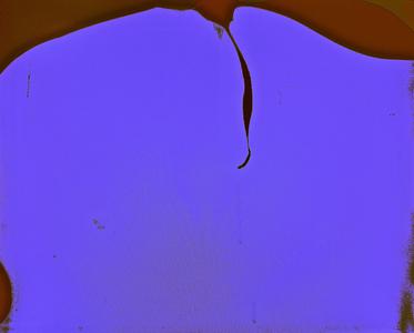
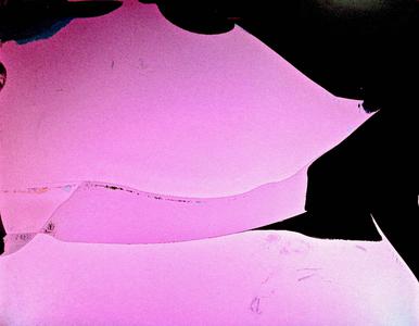
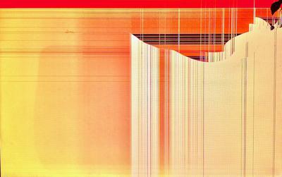
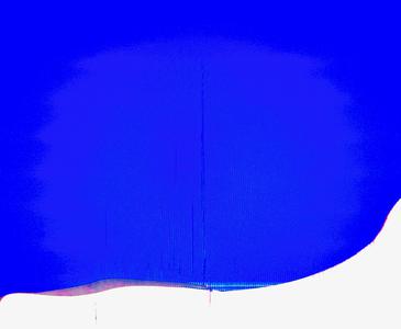
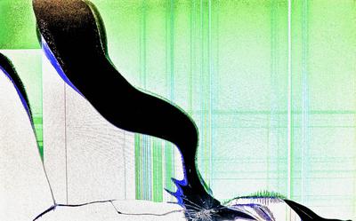
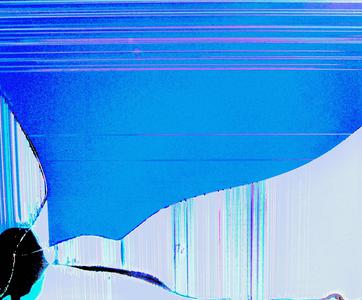
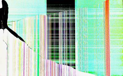
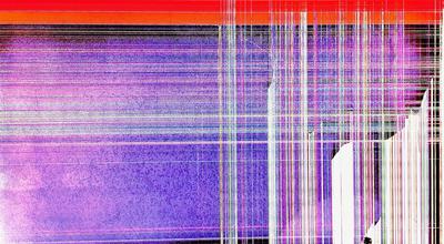
While these works remain interesting in the way they work with colors, they are generally a breather from the artistically complicated works of the past couple of weeks. Rather than nuanced designs, the colors on display here are the main draw. Several of these works also have a fairly coarse texture - chief among those is Samara, which combines a soft, light green with a deep black to emphasize negative space. The graininess of the image helps contribute to the shading, to interesting effect. Waiting Writing Wishes is another example, being just as metaphorical an image but instead using thin lines, both horizontal and vertical, to frame its grainy gradient. Underflur is a bit less coarse, but it emphasizes a rare deep yet light blue, and the glades and cliffs that give the picture a sense of movement utilize an uncommon and fascinating compositional style. Hang-Up is even less visibly coarse, but is one of the most interesting works in this collection. Utilizing a darkened lavender, contrasted with a subtle maroon, Hang-Up is extremely abstract yet very unique among the rest of this gallery's abstractions. Finally of note, my personal favorite work this week is Mango Citrus, named for its color more than for its design. Presenting a tasteful gradient from red to yellow and a smooth, if ridged, texture, it is one of this collection's most cohesive designs. Please enjoy!

