Collections >
BMAT - Bruised Modern Art Typography
[ Previous / Next ]
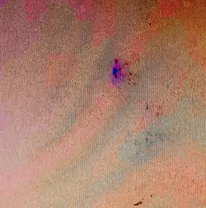
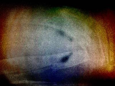
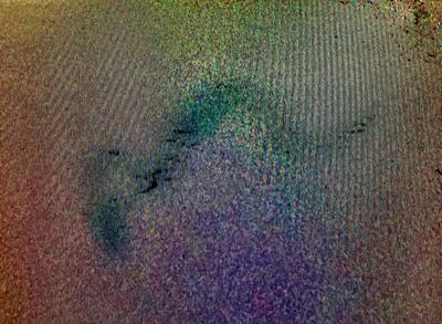
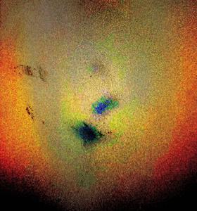
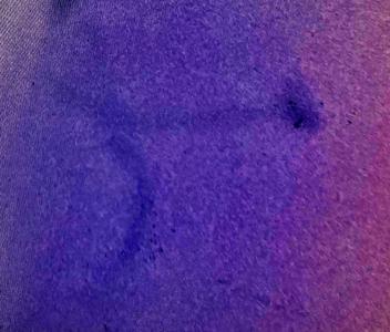
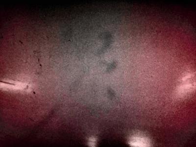
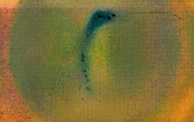
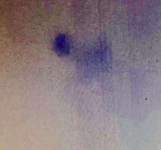
Following on from last wee's collection, Bruised Modern Art Punctuation, this collection has more of the same, except with an enhanced scope, covering typographical marks in general rather than just punctuation. Some works are more straightforward than others - works like Long Division and Open-Paren are somewhat less open for interpretation than works like Kebab or Close-Paren. In terms of color, Long Division is the most interesting - a vivid purple - but in general color was chosen based on what made the underlying piece of punctuation most visible, rather than for aesthetic reasons. Next week will be back to your regularly-scheduled modern art, but for now, please enjoy!

