Collections >
AAMA - Anxious Artifactory Modern Art
[ Previous / Next ]
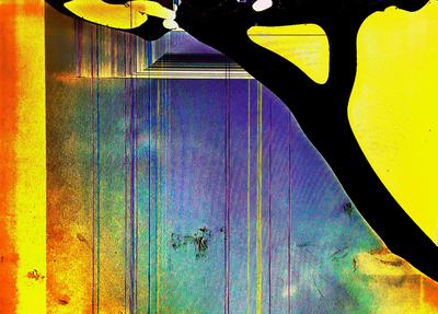
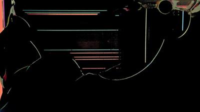
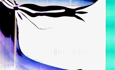
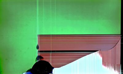
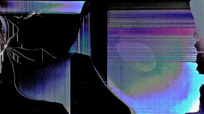
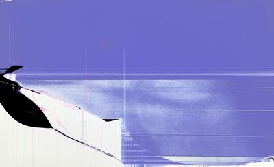
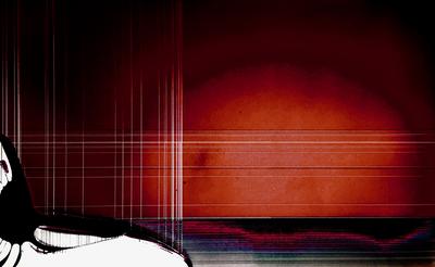
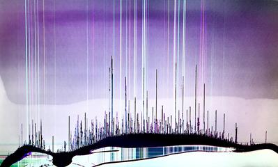
As this collection's truly abstract title would suggest, there is no real cohesive theme to these works, save that they are all as unique as any set of works can be. Starting off, Dark Dichotomies is fully composed of negative space, with the exception of a few highlights that attempt to define some contours structure; to what extent that attempt succeeds is debatable, as this work is highly abstract. Next, Sweep of Seabreeze is a calm, muted work with a pale, unsaturated blue backdrop and a fairly simple foreground in white. Notable to this work in particular are the brushes of translucent white on top of the background - a shading style rarely seen in this gallery. Greedy, Imperious Arm is a loud, straightforward work using the typical negative space to contruct its subject, and shadings of blue and cyan around the borders of the work to provide contours and borders. The work's texture is rough, such as to emphasize the mood of the work, and the bulbous shape of the arm itself reinforces the impressions the title seeks to impart. By contrast, The Light that Makes the Tunnel is quiet but not understated - rather, its dimness contrasted with its choice of color for when it does use it, and the strength of its foundation, makes it a strong, meaningful work. Its texture is a little bit stilted, reflecting the texture of the tunnel being portrayed, and the work's vertical lines provide structure for exploration into the tunnel, into the area of light in the middle of the darkness. And tied with it for my favorite work in this collection is The Many Staves, which does a masterful job of combining different methods of shading, textuing, and color usage to construct a layered image. The foreground is made up of solid colors and an almost translucent, typical modern-art texture; behind it, black negative space, and behind that a lighter violet area that contrasts against its darker background due to its lighter color better hiding its texture, making it seem smoother. The staves in the front, made of black negative space, are placed ahead of the columns of colored light behind them, which themselves seem to almost rise out of the background. Overall, a very cohesive image that amalgamates many techniques to produce an inventive and original work. Please enjoy!

