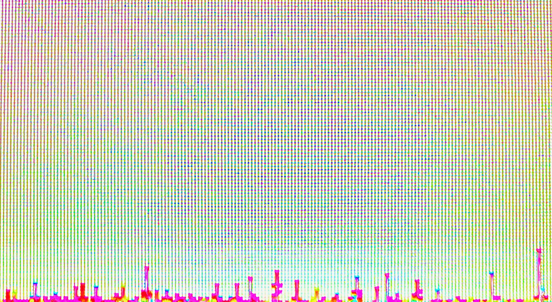
This work is very straightforward - bars of verying lengths along the bottom, against a calm background which is cyan-green towards the bottom, to contrast with the bars themselves, and gradients up to a magenta-blue at the top. The height of this work helps to emphasize the scale, and perhaps to imply that there is more to the graph to either side, perhaps to take advantage of the space - or, possibly, to simply emphasize how short each data point is. Without axes, it's impossible to be sure.
