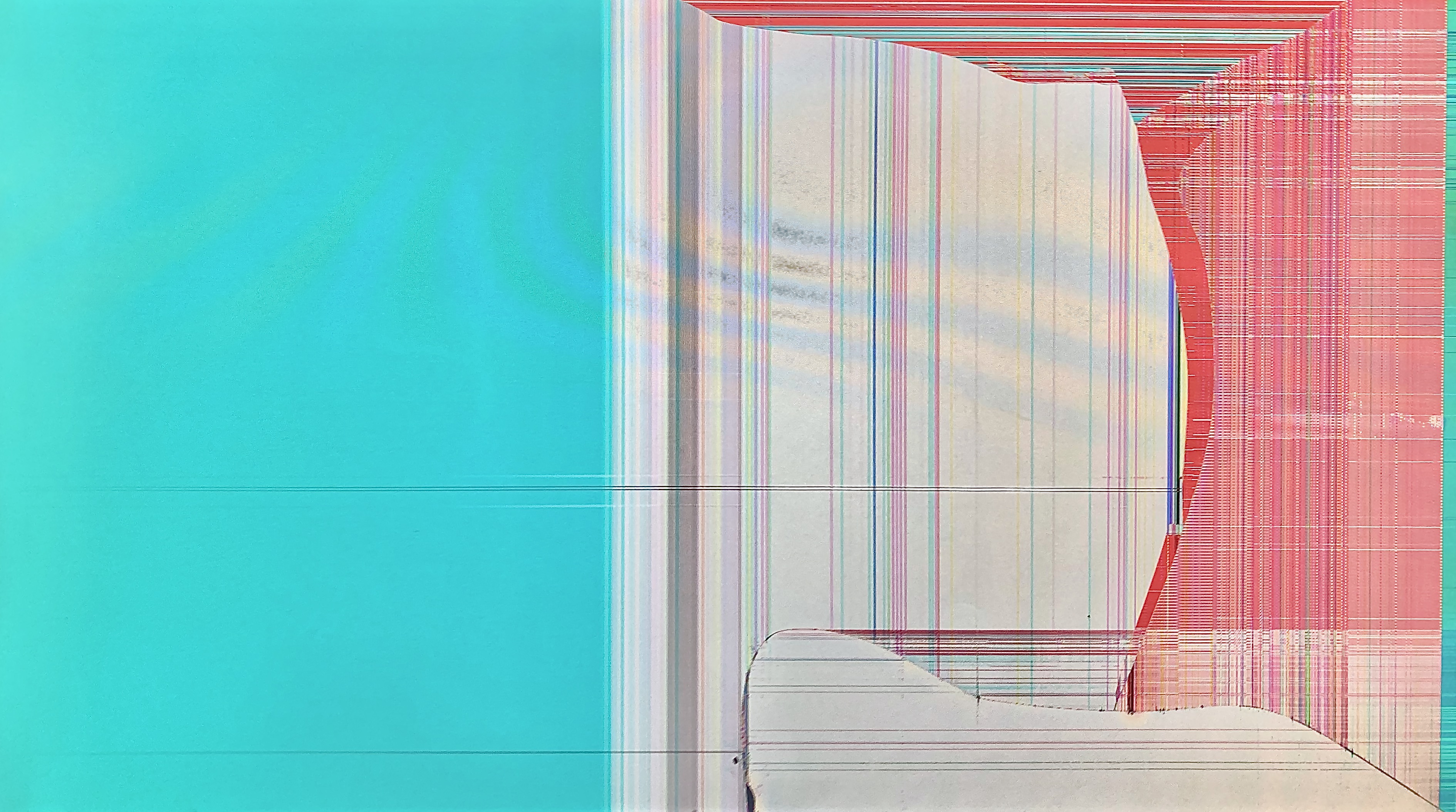
This is a bright work with solid color separation between the different parts of the image, but the contrasting red and blue sections are held away from each other by an intermediate white section. The way that the red tries to curve around the top of the white section indicates that perhaps the red wants to be combined with the blue, but the white is preventing that. The different texturing between the colors also changes - red is much more structured than white, which has more lines even than blue, which is a solid color.
