Collections >
NMPA - Nonstandard Modern Pixel Art
[ Previous / Next ]
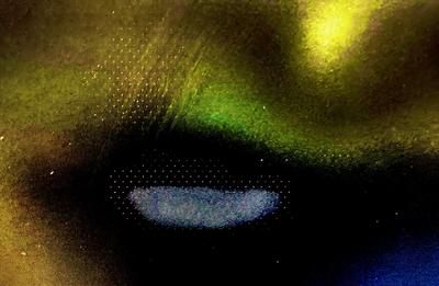
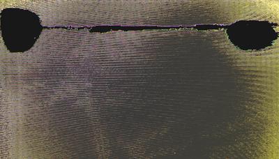
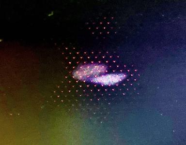
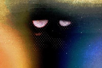
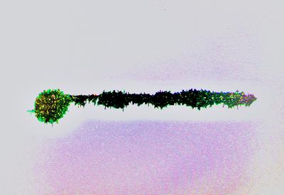
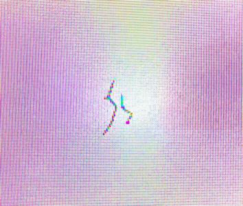
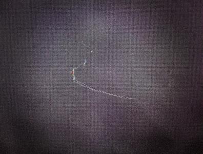
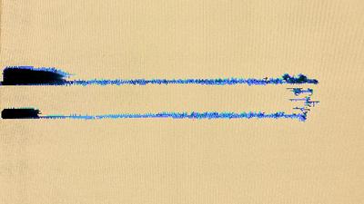
This collection features pixel-scale works that, while relatively concrete in their subject matter, don't follow the usual style of pixel art in this gallery - while some of these works are standard groupings of dead pixels, others are unusual blotches or tiny scratches. One of the latter is S5, a very literal work that appears as just a scribble of its title, against a gradient background from pink to white and back to pink. A closer examination, however, may reveal some depth in the image; the scribble on the right is smaller, and angled differently, from the one beside it, possibly implying it is further back. Its position in the very center of the gradient, in the lightest part of the image, also contrasts with the larger scribble, which is in between areas of pink and white. The other unusual style is demonstrated by Directional Cue, which features a central bright area surrounded by an evenly-spaced field of single-pixel dots, fading away with distance. In this work, the dots are largely arranged in an arrow-shape, indicating towards the right side of the image. The areas of greatest brightness in the center of the image also indicate direction, but not in the same way - there are two distinct areas, separated by depth; one of them is clearly covered by the field of dots, whereas the other is either very close to the dots or in front of them, but also smaller and brighter than its partner. A more standard style of pixel art can be found in Long Key, a straightforward work with a clear interpretation. The background is a light, unobtrusive pink, and fades away around the subject itself, which is mixed in black towards the center with green highlights towards its edges. This subject, as the work's title asserts, resembles a key, with the head on the left and the blade taking up the center and right side. Severe Strike is a work that, while presented at a small scale, could really work at any scale. It's made from a single curved scratch against a regular black background. While the composition is very simple, this is one of those works that achieves elegance from that simplicity. But my personal favorite work this week is Exasperated, a work that speaks for itself. The area of darkness in the center of the work is perfectly shaped to allude to a humanoid head, with the spots of light shaped perfectly to represent tired and unamused eyes. This would make a good reaction image. Please enjoy!

