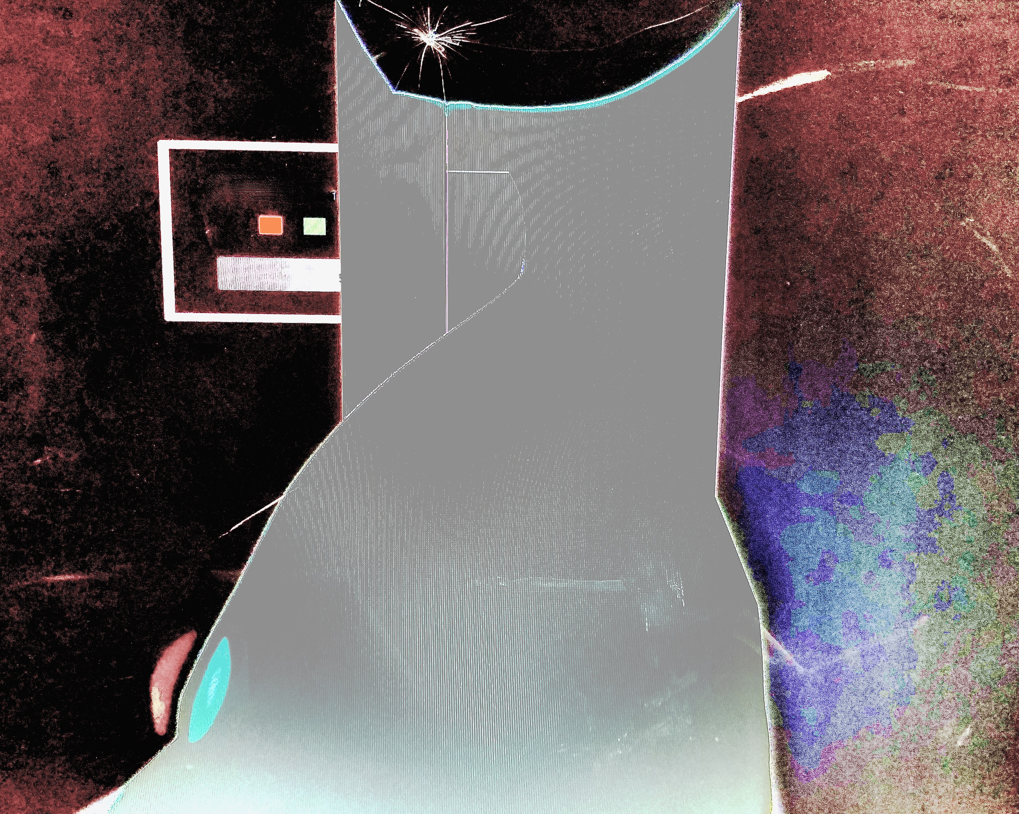
Thanks to Drew for contributing this work. This work takes a common archetype and makes it feel unique with an uncommon color scheme and a couple of interesting compositional tweaks. The background, especially on the right, is rougher than usually seen, with a fabric-like texture. The middle of the tower has a little cut in and bend backwards of one of the tower's edges, which disproportionately helps give the tower character and scale. But it's the solid gray color and smooth texture of the tower, contrasting the background, that makes it really feel distinct.
