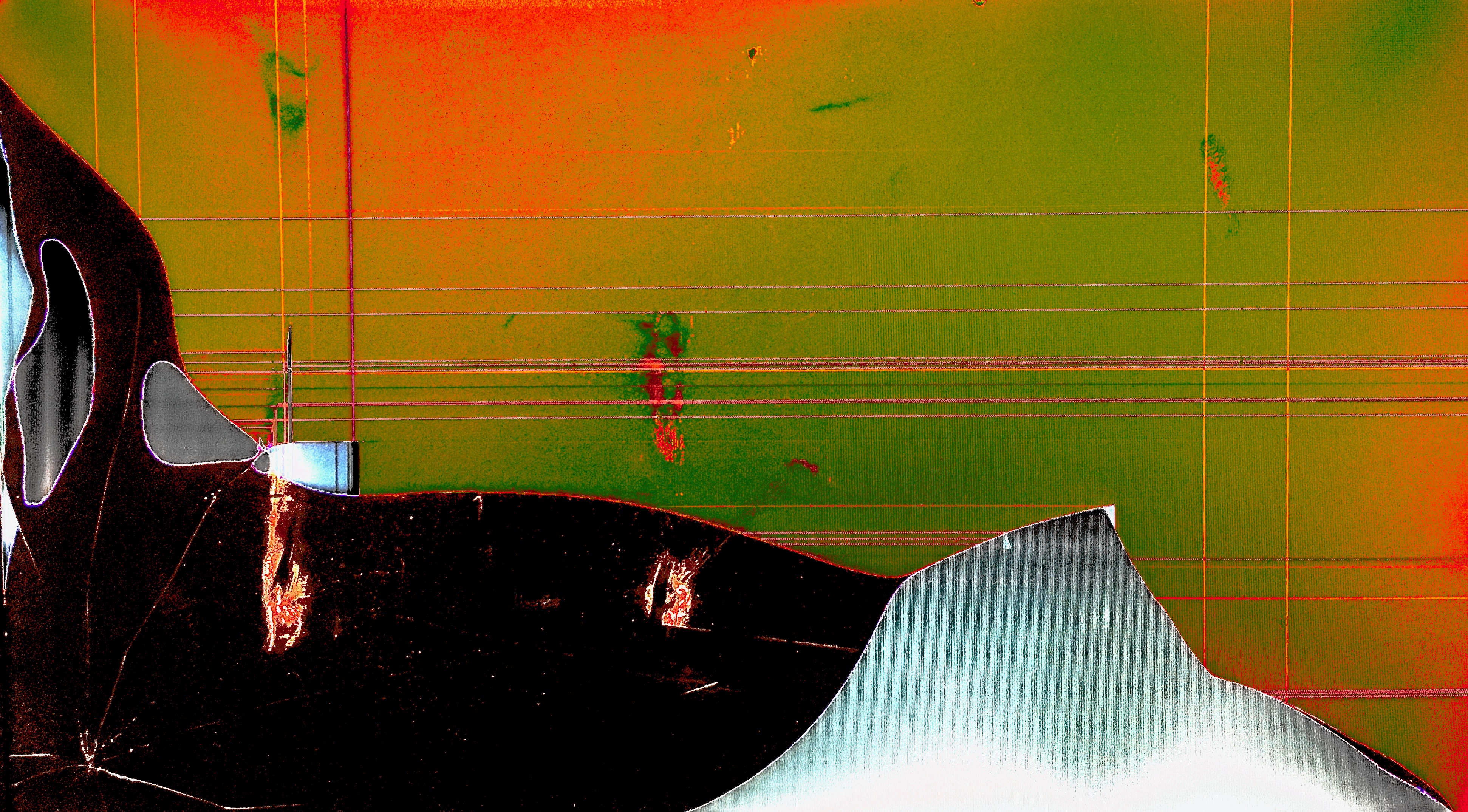
This work takes a dramatic, inventive approach to its background coloration, combining a sickly green with a piercingly bright orange, and somehow blending the two colors well enough to work. The texture and the detail in the foreground, combined with the jarring contrast of the background's two colors, helps to present the destruction to which the work's title refers.
