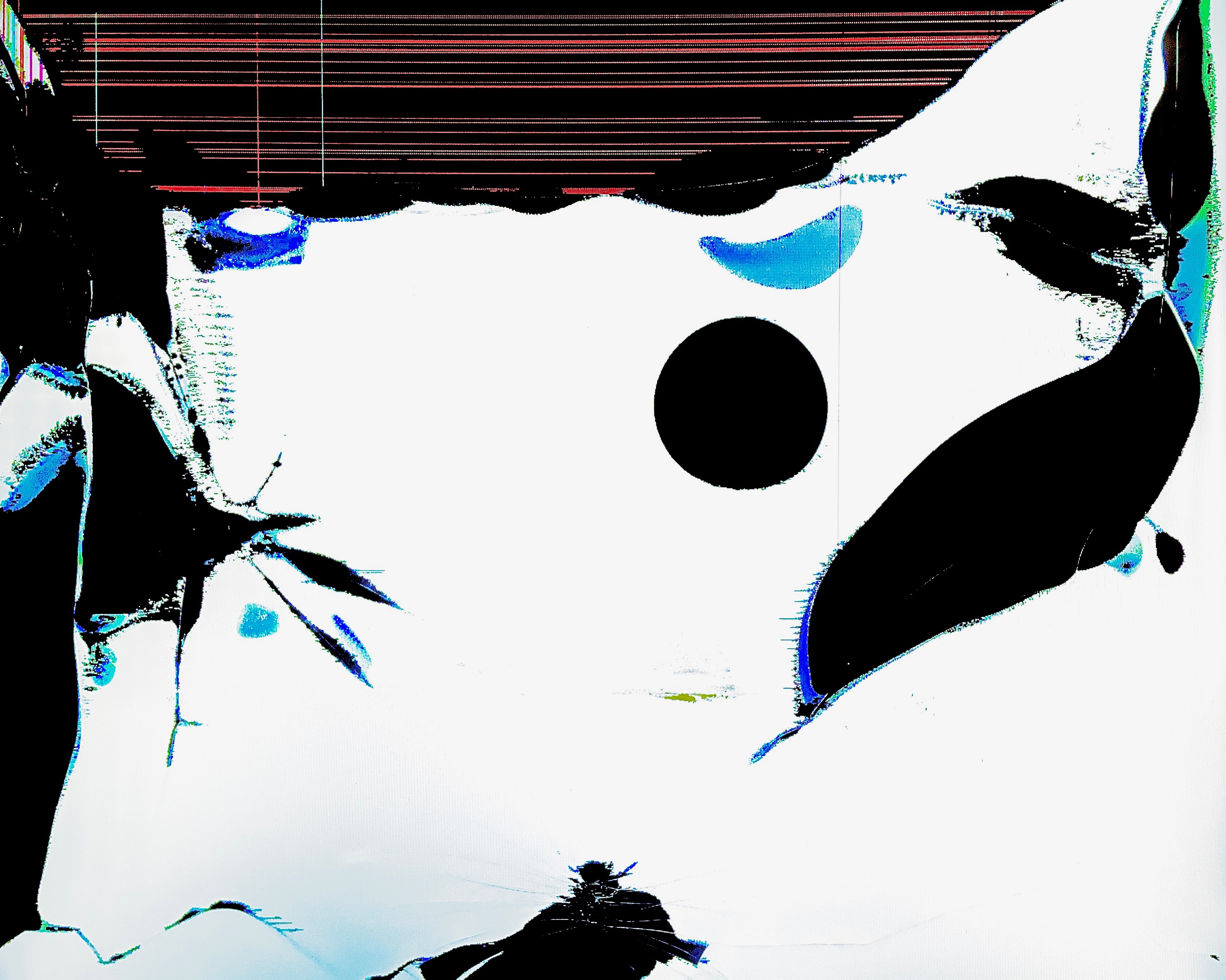
This is one of the most straightforward works in its collection, though also very abstract. The borders of negative spaces are sharp, and the color scheme is a consistent light blue, contrasted with the red horizontal lines towards the top of the image. These lines help add some context to the image, portraying the white surface covering most of the image as a medium, rather than as empty space.
