Hello, and welcome to Monitors of Modern Art!
You can learn more about MOMA here,
browse our various collections, experience an
endless slideshow of our works, or look below for some
highlights of the gallery's best works.
(Warning: This site is not for mobile users browsing on data. Our images are large,
mostly uncompressed, and very data-intensive, so it is advised to view this website on a fast wi-fi
connection.)
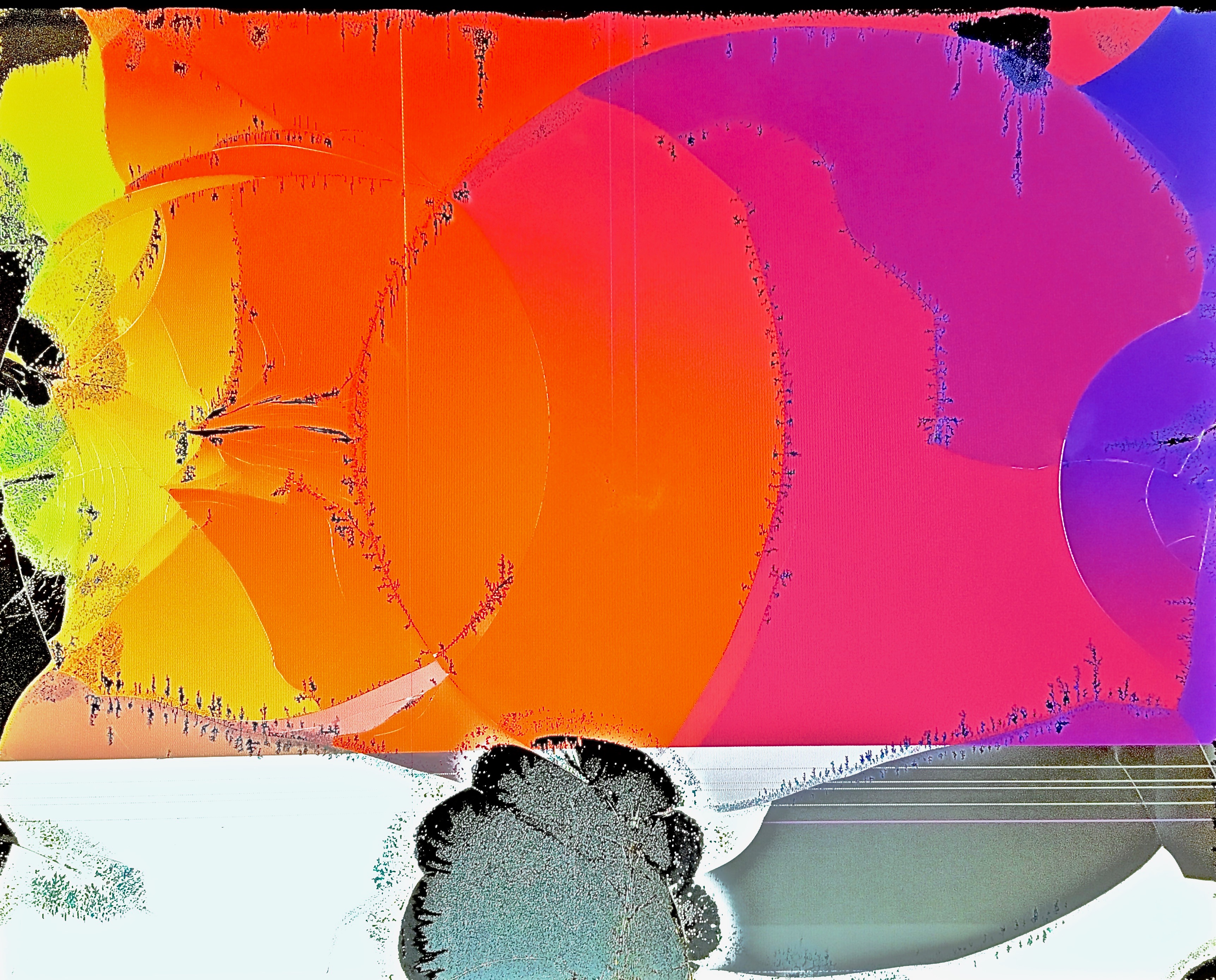
Gradient in Stages is a work that is unapologetically genuine in a way that almost no other work in this entire gallery can be, and which manages to be wholly unique in its compositional design. Very little of this work was manufactured after the fact - what you see is almost exactly what the monitor looked like before I took the photograph, and it remains, in my opinion, the most incredible monitor I have ever found.
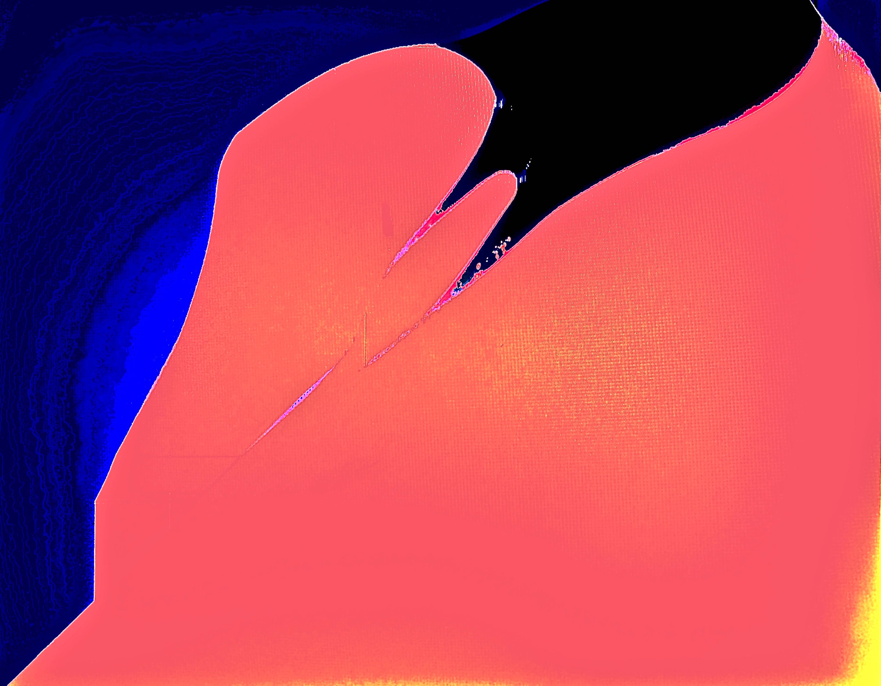
This work exemplifies elegant simplicity with both its design and its color scheme. The interesting texture in the blue background of the work simply complements the consistent tone and texture of the reddish foreground, with the contours of the image just suggesting the shape of a suit jacket without being too overt.
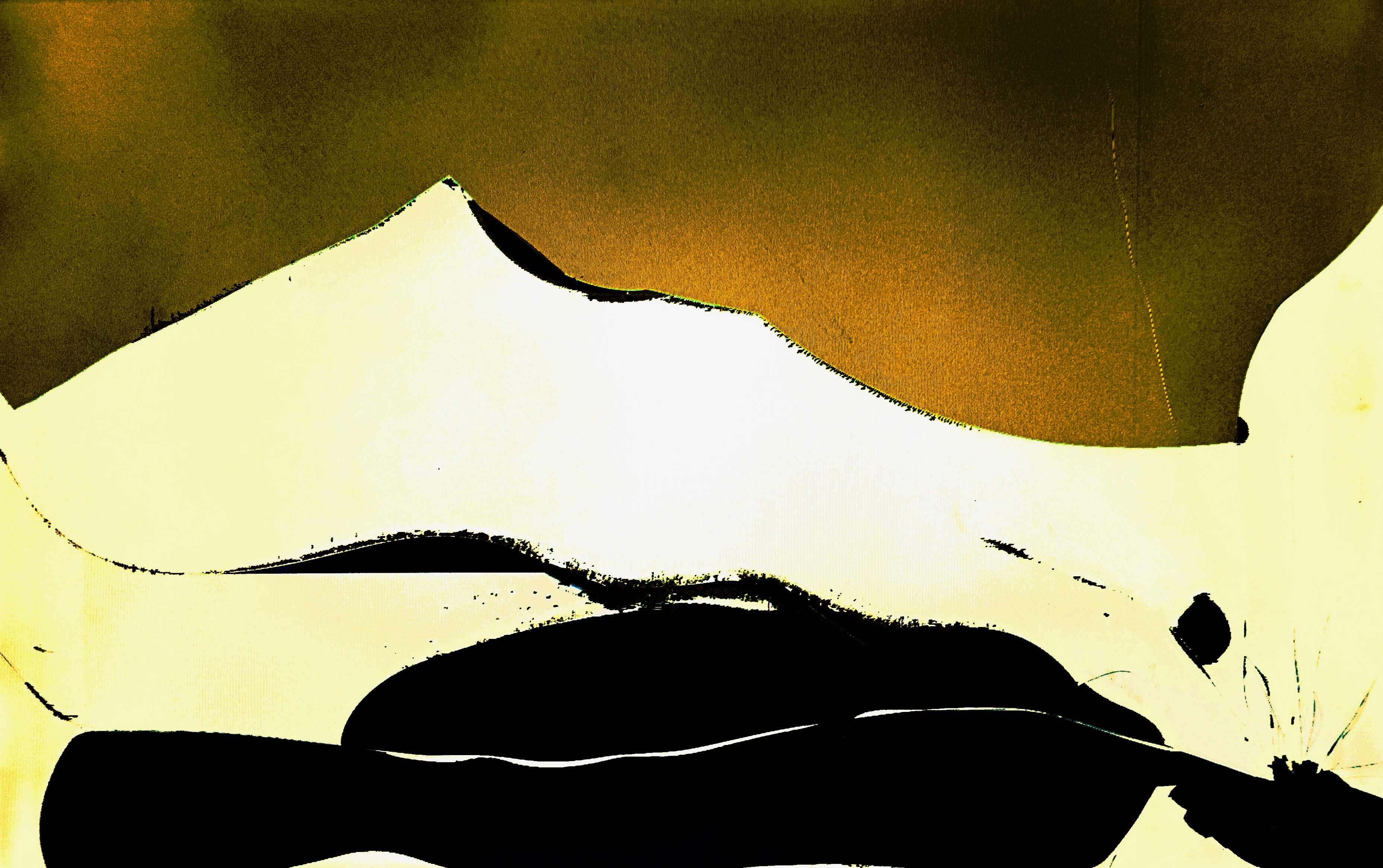
This work is overtly positive, mainly through its choice of palette. And yet, it remains somber, also partly through its choice of palette, as well as in structure as the negative space in the foreground seems to gaze into the distance. It also serves as a good example of a work that shines in its simplicity.
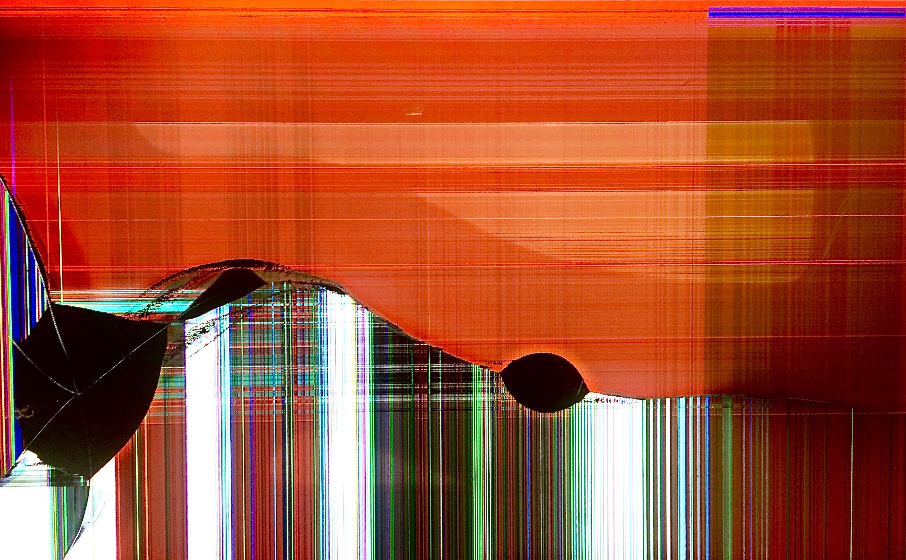
A calming work, representative of an entire class of the works in this gallery. The sunset motif is heavily visible in the background's orange-red color scheme, with the setting sun reflected in the lighter areas of the background. The feeling rolls across the smooth yet turbulent foreground from light into shadow, representing the shift from day into night.
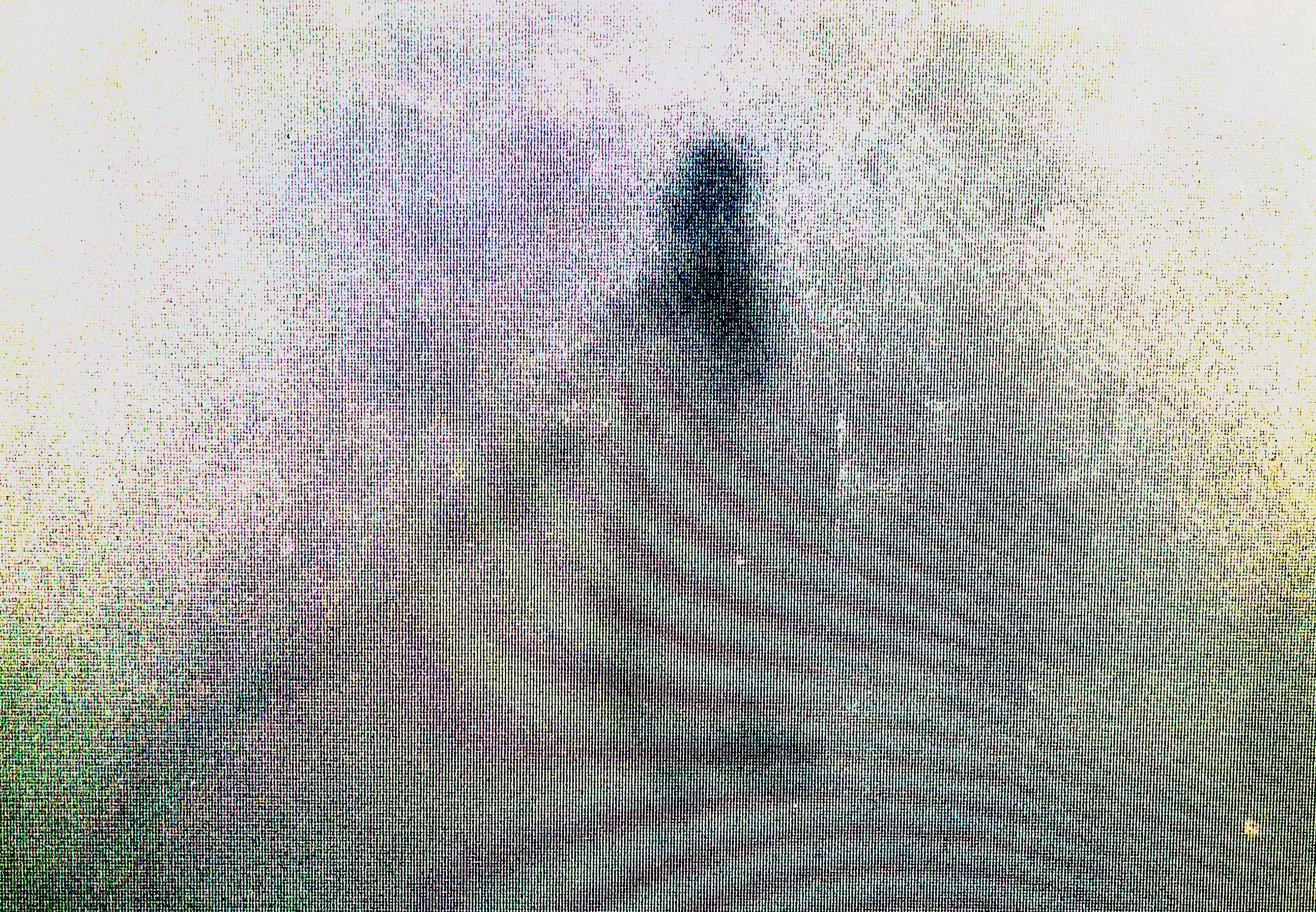
This is a very atmospheric work whose central figure is cloaked in what seems like fog, only its upper torso and head visible - and its sword. The work's lighting also reinforces its composition, darkening towards the center, and the texture and moire give depth and movement to the fog, all coming together to create a truly unique and impactful work.