Hello, and welcome to Monitors of Modern Art!
You can learn more about MOMA here,
browse our various collections, experience an
endless slideshow of our works, or look below for some
highlights of the gallery's best works.
(Warning: This site is not for mobile users browsing on data. Our images are large,
mostly uncompressed, and very data-intensive, so it is advised to view this website on a fast wi-fi
connection.)
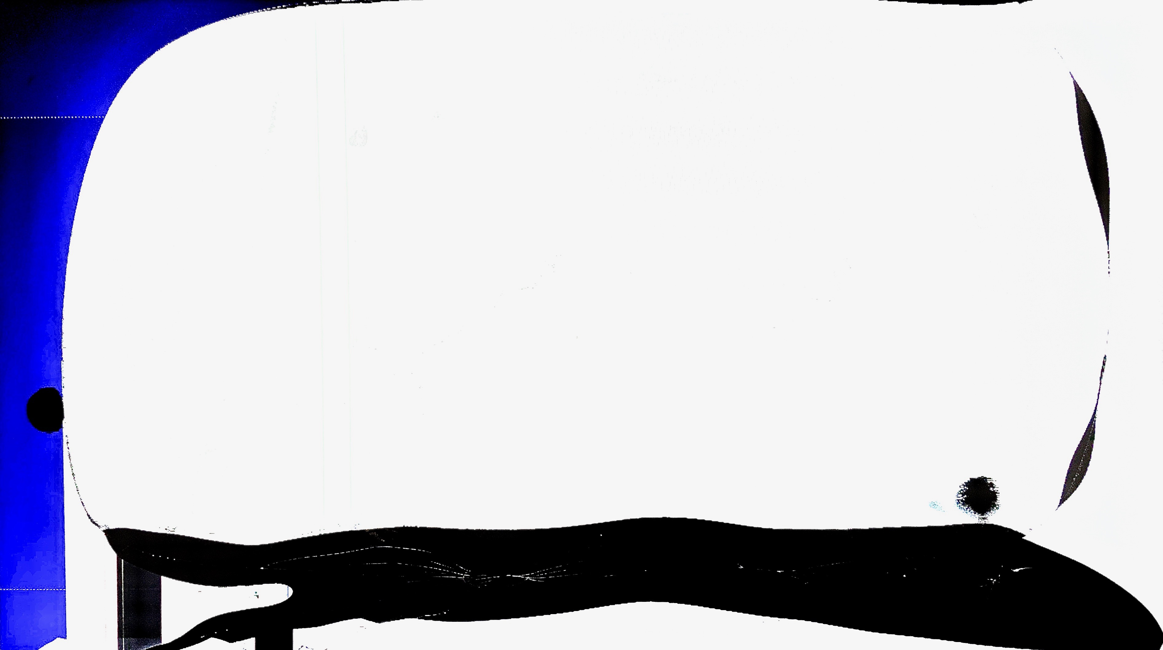
This is the single best reaction image that this gallery ever has produced, or likely will ever produce. It is elegance in simplicity, personified.
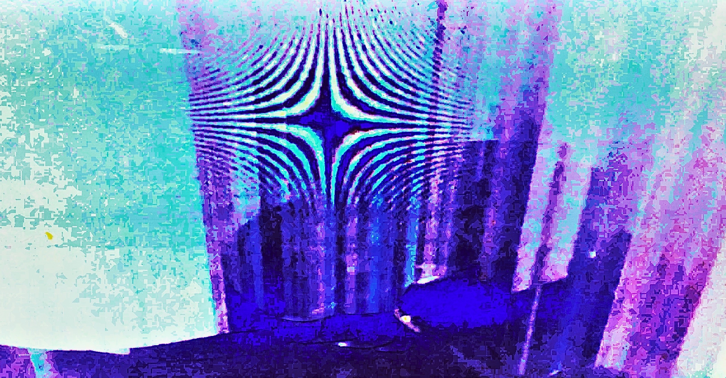
This work is the premier work of its style - tissue-paper shading, as I call it - in this entire gallery. Pleasantly abstract, this work is not without uniqueness and charm in its relative simplicity.
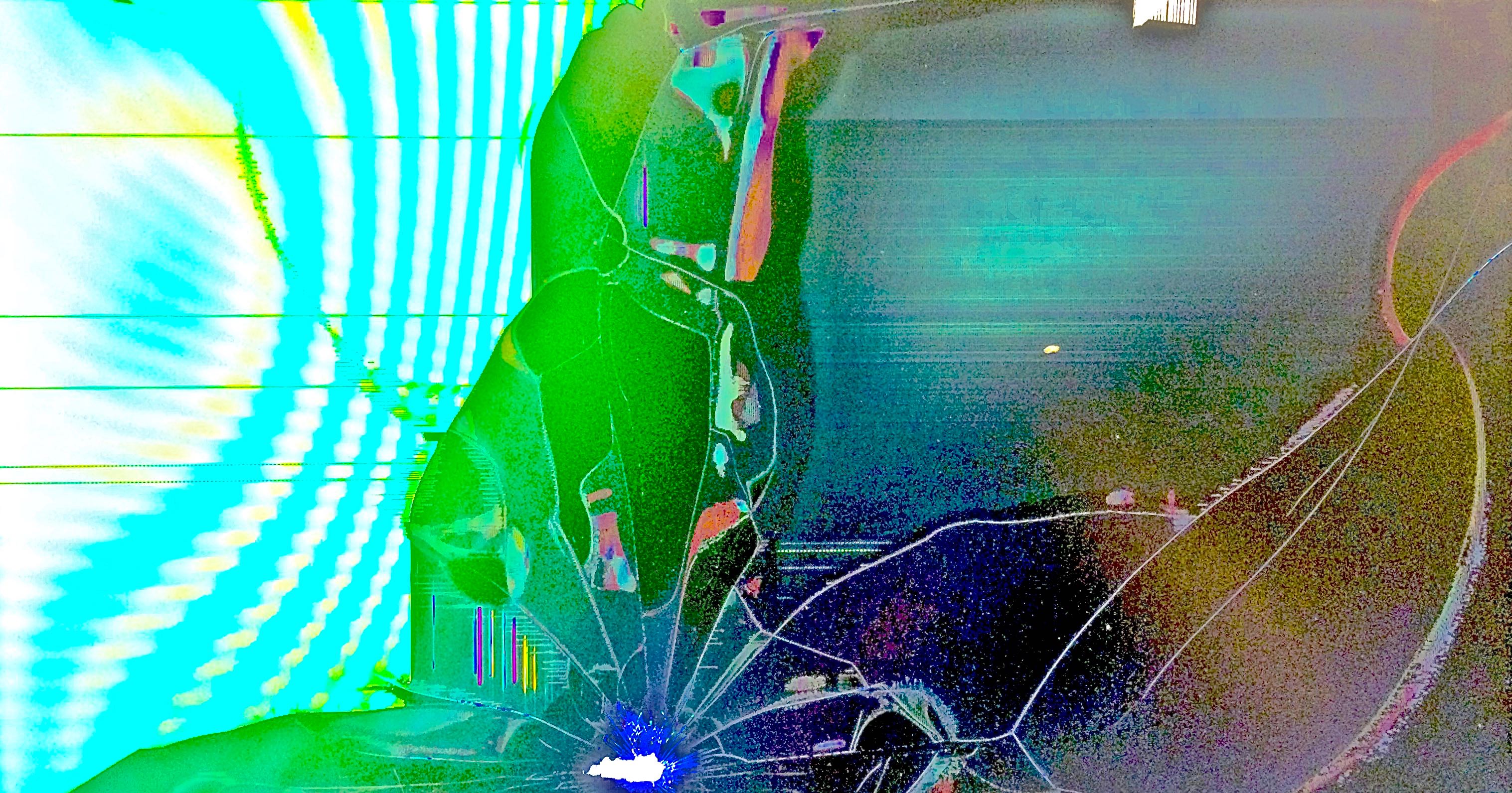
This work uses Moire to its fullest extent. A neon pulse comes from one edge of the image, breaking up and causing cracks in some structure. The pulse's light illuminates the colors and textures of the structure, displaying rough bits of color. This is one of the most fascinating works in MOMA's galleries, with a lot of depth and an inventive and fantastic image. There is a lot to ponder here.
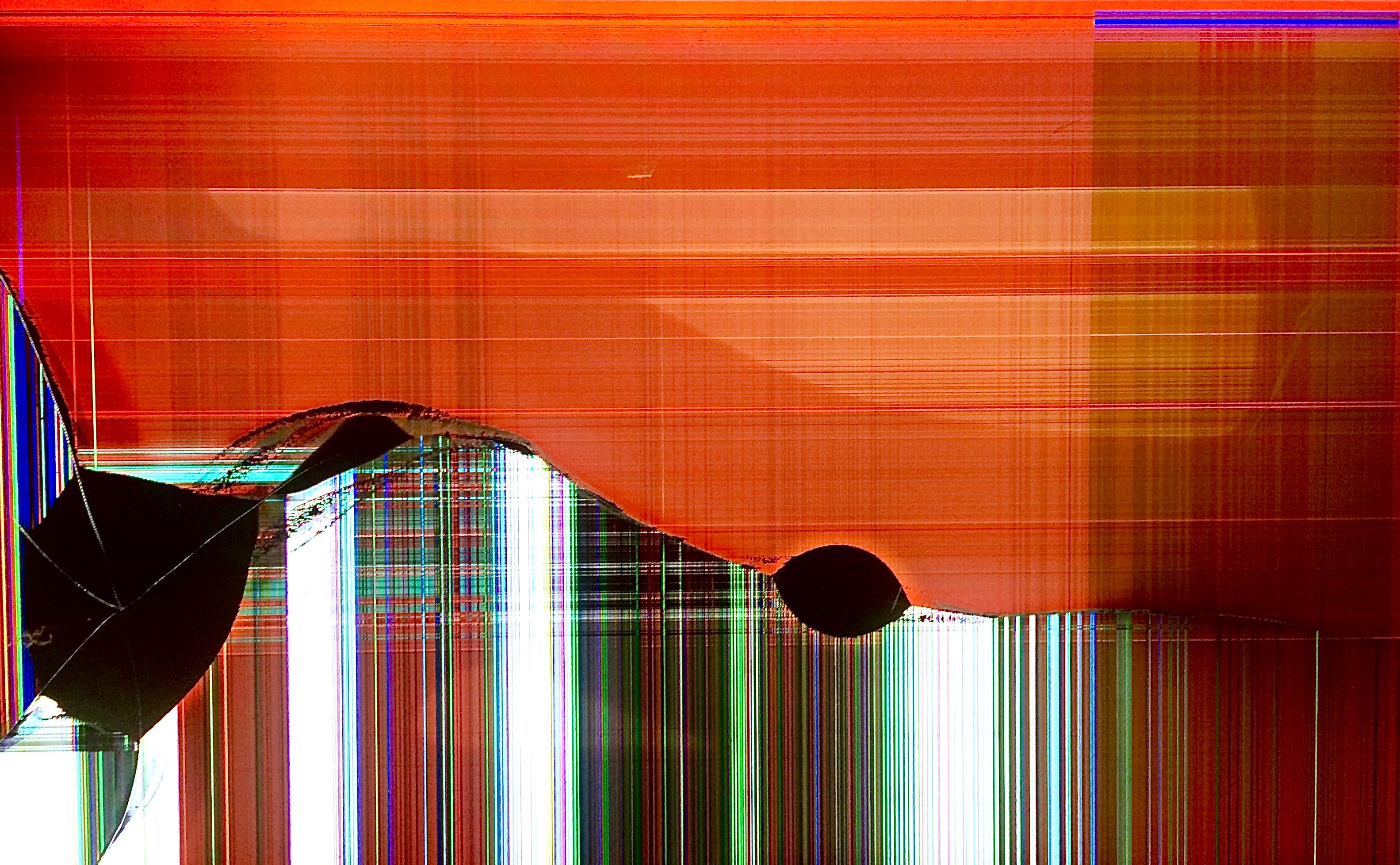
A calming work, representative of an entire class of the works in this gallery. The sunset motif is heavily visible in the background's orange-red color scheme, with the setting sun reflected in the lighter areas of the background. The feeling rolls across the smooth yet turbulent foreground from light into shadow, representing the shift from day into night.
This work boasts a wholly unique compositional style compared to any other work in this gallery, which somehow manages to break from the motifs that its sister works are bound to follow. As is reflected by its name, Cubism alludes to a real artistic style and movement, doing so with just the type of color scheme to be the most effective in that endeavor.